A great small-business website should help someone choose you, take a useful next step and get a good experience afterward. That job extends beyond the page itself: an inquiry needs an owner, a booking needs a reliable record and a promise needs to match the service actually delivered.
This is our planning guide for 2027, written in September 2026. It describes priorities worth designing around, not a prediction of future search algorithms or a guarantee of sales. Some businesses need a rebuild; others can make their existing website work better by improving the content and the handoffs behind it.
For Charlotte owners, the strongest starting point is specific: who you help, what problem brings them to you, why your approach matters and what useful thing they can do next.
A clear customer and a problem worth solving
An ideal customer profile, or ICP, is a practical description of the people or businesses you can serve well. Include their situation, the job they need done, buying concerns and what makes an engagement a good fit.
“Everyone in Charlotte” offers little direction to a designer or a prospective customer. A hypothetical contractor specializing in owner-occupied renovations has different questions to answer from one focused on commercial build-outs. Both can serve a broad area while being specific about their work.
A useful niche can also be a community with shared concerns: independent restaurant owners, families preparing a home renovation or neighborhood retailers planning their first online store. Understand its questions, vocabulary and trusted gathering places. Publish something that helps that community make a decision, then learn from its response. Local relevance comes from understanding people and showing up usefully, not simply placing “Charlotte” in every heading.
Describe the pain in the customer’s language. Are they worried about disruption, unclear costs, inconsistent follow-up or choosing the wrong service? Build the page around that decision. A strong hook identifies a recognizable problem and offers a credible path forward. Keep the promise within what your team can actually deliver.
Try finishing this sentence: “We help [customer in a situation] get [useful result] through [specific service or approach].” Ask someone outside the business to explain it back without extra coaching.
A distinctive brand with a believable story
A logo and color palette help people recognize you. The story helps them understand you. Show the situation a customer faced, what your business did and what changed, using evidence you can support.
Where you do not have outcome data, be precise about the work itself. A process explanation, authentic photograph or sample deliverable can be more useful than an unsupported claim about growth. Get permission for identifiable customer stories and explain when work is historical.
Hunter Creative’s Sonshine Construction project connects a brand refresh with a website and physical collateral. That history illustrates a design principle: customers should recognize the same business across their different points of contact. It does not demonstrate a new AI capability or a quantified sales result.
Make the voice yours. A Charlotte restaurant, steel business and professional practice should not sound interchangeable after an AI writing pass. Use real questions, service standards and details that could only come from the business.
Useful answers, search visibility and AEO
Plan content around the decisions customers need to make: service fit, process, preparation, timing, limitations and the next step. Give those answers clear pages, readable headings and supporting evidence. Keep important content available in the page’s HTML and make it easy to navigate.
This supports people using traditional search and AI-assisted discovery. Google’s current guidance says established SEO practices remain relevant to its generative AI experiences; no special AI markup or text file is required. Following that guidance does not guarantee indexing or citation. Google’s AI search guidance.
Use accurate titles, canonical URLs, internal links, a sitemap and structured data that matches visible facts. Keep your business details consistent. Avoid producing dozens of nearly identical neighborhood pages just to add place names. A genuinely useful service-area explanation is better for the person deciding whether to contact you.
A customer experience that works on a phone
Imagine a customer checking your site between errands, on a smaller screen, with limited time. They should be able to read the page, understand the action and finish it without fighting the interface.
Use readable type, generous controls, clear form labels, understandable errors and a confirmation that explains what happens next. Test keyboard navigation and assistive technology as part of the experience. Accessibility considers how people perceive, navigate and interact with content—not simply whether a scanner returns a good score. W3C’s accessibility introduction.
Performance matters throughout that journey. Google’s Core Web Vitals cover loading, responsiveness and visual stability. Lab tests help find problems; real-user measurements show what actual visitors experience. Web Vitals guidance. Compress images, avoid unnecessary scripts and test the contact flow on a real phone. A decorative animation should never make the primary task harder.
Value before someone is ready to buy
Many visitors are still figuring out their problem. Offer a useful way to make progress: a checklist, comparison, preparation guide or worked example. That helps demonstrate the way you think and gives a potential customer a reason to return.
For a hypothetical Charlotte event business, a venue-preparation guide could help visitors decide what information to gather before requesting a proposal. For a trades company, a project-readiness checklist might reduce unproductive back-and-forth.
A lead magnet can extend that value, but show enough on the page to earn trust. Describe what an email signup means, collect only what is needed and keep the path to a direct inquiry clear. Our free resources provide a growth playbook and AI starters; the checklist below is usable without sharing an email address.
Growth loops that start with a useful experience
A growth loop is a repeatable path where one useful interaction helps create the next. For a small business, it can be straightforward: answer a question well, provide a shareable resource, earn a conversation, learn from that conversation and improve the next answer.
Build a voluntary referral path into a good customer experience. Ask for feedback at a sensible point, provide a clear page someone can share and make it easy for a referred visitor to understand your work. Do not manufacture reviews, force referrals to unlock help or add people to marketing lists without an appropriate basis.
Track the sequence in practical terms. Which guide started a conversation? Which question keeps appearing? Which customers refer similar work? Use those answers to improve the content and service. More traffic is useful only when the business can serve the resulting demand well.
Connections behind the digital front door
A website can be the starting point for customer service and sales, with a dependable connection to everyday work. That does not mean every business needs a complex operating platform or an autonomous agent.
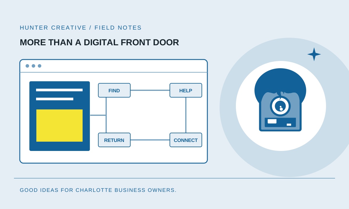
The example below shows one possible inquiry journey. It is a design pattern to adapt, not a claim that every step is automated on Hunter Creative’s site or included in every project.
- Find an answer. A visitor reads a relevant service page or useful guide.
- Make a clear request. A short form collects the details needed for the next conversation.
- Keep a reliable record. The request is stored in the appropriate system, with a source and next action.
- Give someone ownership. A notification reaches the responsible person; failures can be detected and retried.
- Prepare a useful reply. Approved context can help a person or AI-assisted process draft a response for review.
- Learn from the outcome. The team records whether the request became a conversation, proposal, customer or poor fit.
Decide where the authoritative record lives and who maintains the connection. Test duplicate submissions, unavailable systems and missing notifications. Explain manual steps honestly. A reliable manual review can be a better first implementation than an opaque automation nobody knows how to repair.
Our AI operations guide explores possible next connections. Review the tools you already pay for before introducing another platform.
Measurement, trust and maintenance
Choose a small set of events tied to business questions. For example: was a request durably accepted, did someone follow up and did the inquiry fit the service? Distinguish those outcomes from a click or an opened form.
Use appropriate consent and keep personal information out of analytics payloads. Understand what each tag collects. Limit access to customer records and record how integrations can be turned off or recovered. An impressive dashboard is not useful if its definitions are unclear or its data is inaccurate.
Assign someone to content accuracy, security updates, backups and inquiry monitoring. Test recovery and forms periodically. Define what is included in ongoing care and what would be a new project. The website’s usefulness depends on the business continuing to maintain its promises and connections.
Your connected-website checklist
Review these items with someone who serves customers every day. Mark each working, needs attention or unknown, and attach an actual example. An unknown is a useful research task, not a reason to invent a reassuring answer.
- Audience: a visitor can recognize who the service is for and whether it fits their situation.
- Value: the opening explains a real problem and a credible benefit in plain language.
- Story: the page demonstrates the approach with supported details, not generic promises.
- Local relevance: service areas and customer examples reflect the work you actually do.
- Answers: common buying questions are easy to find and kept current.
- Search foundations: important pages are crawlable, internally linked and accurately described.
- Usability: the main task works on a phone, with a keyboard and with clear form feedback.
- Performance: images and scripts support a fast, stable experience.
- Useful resource: a visitor can make some progress before booking a conversation.
- Connection: an accepted inquiry reaches a durable record and a responsible person.
- Learning: source and outcome information helps improve the next customer interaction.
- Ownership: maintenance, access, costs and recovery have named responsibilities.
Choose the weakest link that affects a real customer. Agree on one change and how you will know it worked before commissioning more pages or another integration.
That is how we recommend planning for 2027: strengthen the relationship between the story people see, the help they receive and the work your business does behind the scenes. Start a conversation with Hunter Creative if you would like help finding that next improvement.